Hi everyone!
It’s been 2 weeks since the launch of Mockups Gallery. It was very well received which makes me very happy.
A very good side-effect of this launch is that I am now eating my own dogfood. Sure, I’ve been using WireframeSketcher before, but not at the scale that I do now. Designing new stencils makes me see much better what’s needed to improve the tool.
This time the results of my work are an iPad stencil and an updated iPhone stencil. I’m sure you’ll find a good use for them.
Changes
Now to the changes that make these new stencils possible:
- New Rectangle widget. This is very similar to the Panel widget with the difference that you can set an icon and enter some text. This makes it easy to do things like this:
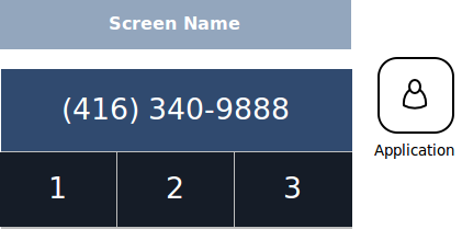
- Added text and icon properties to Circle widget. Similar with Rectangle this makes it super easy to do things like this:

- Added icon position property for Label, Circle and Rectangle widgets. This makes it possible to layout vertically an icon with a label. Like this:
- Added horizontal lines toggle for List widget
- Added font properties for List and Table widgets
- Added row height property for List and Table widgets. These 3 make it a no-brainer to draw menus for mobile applications:
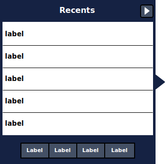
- Improved Progress Bar widget to support vertical resize and bar color:

- Improved sliders in Properties View to display tooltips with their value
- Added New icons: book, apple, backspace
- Added background color property for Button Bar widget
- Added support for external file editing (using File > Open File…)
- Fixed Search Field widget to use white background instead of transparent
- Fixed foreground color inversion for List, Table and Tree widgets
Updating
As usual to update to the latest version of WireframeSketcher just use the Eclipse update manager.
Enjoy!
Hi everyone,
I have great news. Today I am launching the Mockups Gallery website!
As you can guess from the name it’s a gallery of reusable mockups, wireframes, templates, UI snippets and components that you can use in your own designs. It’s a place that we can all use to share resources and save time for each other.
The idea was suggested to me first by Laurent Malvert back in February. It took me some time before I felt comfortable creating such a website. I am confident that we finally have enough building blocks to make this website possible!
Mockups Gallery is powered by Posterous which makes things dead simple. You can share your own contributions by simply using your favorite email client:
- Start by composing an email to post@mockupsgallery.posterous.com.
- Give it a relevant subject (e.g. iPhone stencil). You can tag your submission by ending the subject like this: ((tag: iphone, mobile))
- Add a description in the body. You can include a link back to your website.
- Attach the .screen file (or files) and exported PNG image files (for thumbnails)
- Send it!
I’ll review the contribution and it should be public shortly.
You can contribute in other ways by improving what’s already there, commenting, favoring, suggesting ideas and by spreading the word. So lets grow the Mockups Gallery together and we will all reap the benefits from it!
Hi there! It’s time for a new version of WireframeSketcher. The theme of this release is adding more flexibility to allow mockups for iPhone, Android and other platforms.
I am seeing more and more requests for widgets and containers for iPhone, Android, iPad and other popular devices. I was thinking for some time about the best solution to this problem. It’s clear that the most extensible approach is to allow custom stencils or component libraries.
To make custom stencils possible there is a need for generic enough building blocks. So this is what I was concentrating on and I think we are finally in a place where interesting things are possible.
As a test case I chose to create an iPhone stencil. Here’s a preview of what it looks like:
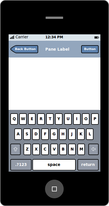
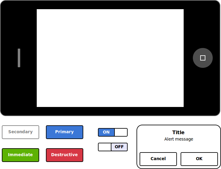
Here’s the screen file that you can use in your own mockups (you need to update WireframeSketcher to the latest version). I’d like to hear your feedback on this and on what can we do to improve things further!
Now lets get to the changes in this release.
More flexibility
Here’s a quick list of changes that make the above iPhone mockups possible:
- Added button style property for Button widget. There are 3 choices: Point Left, Square, Point Right.
- Added border style property for Panel widget. There are 3 choices: None, Solid, Solid Rounded
- Added border color property for Panel widget
- Added new Circle widget
- Redesigned many icons for better sharpness and contrast
Other changes
Here is the list of other changes in this version:
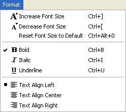
- New increase/decrease font size actions. Use Ctrl+] or Ctrl+> shortcut to quickly increase font size, Ctrl+[ or Ctrl+< to decrease.
- New top level Format menu:
- New ButtonBar widget:

- Added the possibility to dim master screens in design mode. This lets you make a clear distinction between widgets in your screen and widgets included from the master.

- Snapping now works with widgets included from master screens. This was a small change in code but the improvement is huge. This is how it should have worked from the very start. Give it a try!
- Added font and align properties for TextArea and TextField widgets
Updating
As usual to update to the latest version of WireframeSketcher just use the Eclipse update manager.
Enjoy!
Hi there! It’s time for a new release of WireframeSketcher. I know, it’s 1st of April and all, but I just couldn’t wait till next week. Hopefully you’ll take this blog post seriously :)
Arrows and curly braces
This version brings 2 new annotation widgets: Arrow and Curly Brace. Arrows in particular were continuously requested for a long time but I kept postponing them since I wanted the implementation to be perfect. Big mistake! It would be much better to have an imperfect implementation that gets the job done than nothing at all. So I finally took a day and put arrows in there:
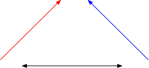
I know that it would be much better to manipulate Arrows as arrows and not as rectangles. But it’s something that can be perfected later.
Curly Brace widget let you annotate your mockups like this:
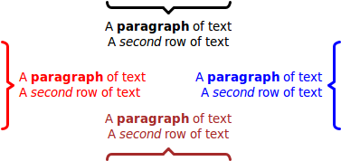
Wiki syntax for lists and headings
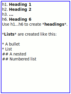
Another novelty in this version is the new wiki syntax for bullet lists, ordered lists and headings. You can now reuse your existing wiki skills to mockup web pages in a much faster manner:
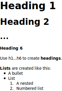
The wiki syntax is based on Textile and here’s an example of what it looks like:
Other changes
Here is the list of other changes in this version:
- Fixed the problem with lost transparency in scaled images
- Small look improvements for Window, Browser, Video Player and Map widgets
- Fixed the vertical alignment of embedded icons on Windows
- Fixed how font properties work when applied to widgets with different font settings
Flash Builder 4, ColdFusion Builder and RAD
Last week was marked by a release of Flash Builder 4 (former Flex Builder) and the first version of ColdFusion Builder. I’ve added the installation instructions for these new IDEs.
Rational Application Developer users will be pleased to know that their IDE is now also supported.
Updating
As usual to update to the latest version of WireframeSketcher just use the Eclipse update manager.
Enjoy!